Saturday, December 29, 2007

Chris Sanders Designs


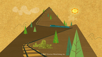
Here are a few more images of what we lost when Chris Sanders left his “American Dog”, now re-titled “Bolt” movie. I would have loved to see how closely they could have realized the lighting in these paintings.

Thursday, December 27, 2007

Disappointing Design

Early on I was excited by the atmospheric concept art I was seeing from the Chris Sanders film "American Dog" for Disney. Now I'm saddened by the redesign and renaming. Pixar did a complete rework on "Ratatouille" and it came out wonderfully but with director Sanders no longer with his film we are losing his fun design and beautiful lighting plan. Take a look at the original concept art and the new and final design for the retitled film "Bolt". It feels like we've lost something. Time will tell.

Chris Sanders version

Redesign on "Bolt"

Friday, December 21, 2007

Happy Birthday Snow White


The film premiered at the Carthay Circle Theater in Hollywood on the night of December 21, 1937 and this year celebrates its 70th anniversary. "All the Hollywood brass turned out for my cartoon!" remembered Walt years later, "That was the thing. And it went way back to when I first came out here and I went to my first premiere. I'd never seen one in my life. I saw all these Hollywood celebrities coming in and I just had a funny feeling. I just hoped that some day they'd be going in to a premiere of a cartoon. Because people would depreciate the cartoon. You know, they'd kind of look down." Those celebrities included Marlene Dietrich, Preston Foster, Shirley Temple, Bob "Bazooka" Burns, Charles Correll and Freeman Gosden (Amos and Andy), Joe Penner, Helen Vincent, Fred Perry, George McCall, Charlie Chaplin with Paulette Goddard, Gail Patrick , Ed Sullivan, Clark Gable and Carol Lombard, Norma Shearer, Judy Garland, Charles Laughton and Elsa Lanchester, Jack Benny, Burns and Allen, Cary Grant and many more.

Great Animation Posts

My buddy Eric has a blog that is a catch-all of things of interest. He has posted some great lessons and tips on animation for animators. His latest on the 'internal silhouette' is well executed. Here is a link to his site and his other animation tips: http://www.sabudesign.com/cattywampus/?cat=7

The pose
The silhouette does not convey the action
The 'internal silhouette' clearly defines the action

Sunday, December 02, 2007

How It's Done

An anonymous person wrote asking how Karel Zeman did his effects. Here is part two of a documentary on Czech filmmaker Karel Zeman's incredible special effects.

Saturday, December 01, 2007

Animation Nation

http://www.youtube.com/results?search=related&search_query=British%20UK%20Documentary%20Cartoon%20Animation%20Animator&v=VnrP_t3MBBQ

Above is a link to ‘skewiff1’s’ YouTube account which holds many interesting bits of animation information. One is the BBC Documentary “Animation Nation” about the history of British animation with examples of such studios as Halas and Batchelor, Larkins, Bob Godfrey/Biographic and Aardman. There is also a Documentary called Walt Disney-“Secret Lives” which looks intriguing. I know how I’ll be spending this Saturday morning.

Check out some great design work from episode 1.5 of "Animation Nation"


Friday, November 30, 2007

Pocoyo

I love everything about these guys. It must be great fun to work on. When will they be available in the states? Find out more about this adorable series here: http://pocoyo.blogs.com/pocoyo/

Thursday, November 29, 2007

More Karel Zeman

Here are some highlights from “Diabolica Inventions” (1958) , a film Zeman did to look like moving woodcuts. A feature film “Fantastic World of Jules Verne” (1961) employees the same technique.

Wednesday, November 28, 2007

Inspirace : by Karel Zeman

Karel Zemans amazing short "Inspiration" (Inspirace), made in 1948, is a love-story set inside a single drop of water, which Zeman animated by heating and bending fragile blown-glass figurines.

The films of master Czech animator and director Karel Zeman (1910 - 1989) are a glittering jewelbox filled with wonders spun from ancient myth and modern science: moon men and underwater pirates, pedal-powered airships and diabolical engines of destruction. Born in 1910 in Ostromer, Czechoslovakia, Zeman began his career as a window dresser and poster artist, graduating to filmmaking in the mid-1940's with a series of shorts featuring his animated alter-ego, Mr. Prokouk. Inspired by the pioneering films of magician/director Georges Melies and the fiction of Jules Verne, Zeman began animating, art directing and often writing his own features in the early 1950's, overcoming miniscule budgets and rudimentary equipment to create his elaborate adventures.

Tuesday, November 27, 2007

Gratz Gone Wild


http://www.oregonlive.com/entertainment/index.ssf/2007/11/tv_commercials_joan_gratz_anim.html

Above is a link to an article by Kristi Turnquit about Portland animator Joan Gratz. She pioneered 'claypainting' and won an Oscar for her "Mona Lisa Descending a Staircase,(see earlier post in archives for film). Now she has transitioned over to computers and I bet she is loving the flexibility.

Artist though she is, Gratz doesn't just create personal projects. Her latest work is a commercial, done for the San Luis Obispo-based company the Spice Hunter. Though Gratz has done commercials for such companies as Coca-Cola and Knorr Soup, the Spice Hunter job presented Gratz with a novel challenge. Her palette this time wasn't colored clay, but the spices themselves, which she animated digitally. "I photographed the spices and threw them on my scanner," says Gratz. "I could control the color and how big they are. It was like having a new set of paints."

Sunday, November 25, 2007

Reference Material


The studies of Eadweard Muybridge have been helping animators for years. Now modern technology has given us new tools. Check out The Animal Motion Show from Rhino House: http://www.rhinohouse.com/


These are clear, full color studies with common actions done in b/w put against grids to help diagnose spacing. I’ve used these DVD references on many projects and found them indispensable.

Although I didn’t work on this, here’s a lovely horse gallop by James Baxter for the movie Spirit: Stallion of the Cimarron. It’s a beautiful cycle as you can see from the Flash movie I’ve make of it. I keep it just in case.


Biggie Cheese

I found this on YouTube. Someone posted the Biggie Cheese sequence I worked on with Jamie Dawkins for the movie “Barnyard”. We did Biggie and the band characters in the background. Jamie did the first portion until the fade to black and my shots are after the fade up. I also did the shaggy dog bass player close-up in Jamie’s section. It was great fun.

Wednesday, November 21, 2007

The Word from Bird


Live action reference for Tinker Bell in Peter Pan


Reference for Lady and the Tramp


Reference for 101 Dalmatians

Brad Bird has added to the debate over Mocap, Rotoscope and Traditional animation. I tried to define the differences between Roto and live action reference in an earlier posting called Rotoscope VS Reference but Brad says it much more clearly.

_____________ Click on images to enlarge

Brad says:

Hmn. Gotta say I disagree with a few of you folks. I consider mo-cap and rotoscope very similar in a few important respects; both have a performance foundation that begins with someone other than the animator, and the ultimate success of each is dependent on how skillfully they are altered from that foundation.

The best characters to begin with a mo-cap foundation (Gollum and Kong–both courtesy of Peter Jackson & co.) were re-worked extensively by animators (some of Gollums best scenes were entirely keyframed– the Andy Serkis reference studied and interpreted by eye rather than by computer).

This is true of rotoscope as well. When great animators extensively rework the live action base you get Cruella DeVil, Captain Hook, Smee, Chernabog from Night On Bald Mountain, etc…

But when an animator simply accepts the live action perfomance without strengthening the poses or finessing the timing and lazily traces a hand over a hand, a shoulder over a shoulder, you get the watery, dull, unconvincing Prince in “Snow White”, Gulliver in “Gullivers Travels”, Anastasia in “Anastasia”, and EVERYBODY in Bakshi’s “Lord of the Rings”, “American Pop”, “Fire & Ice”, etc.

I would argue that talented animators did some fantastic reworking of Andy Serkis’ very fine initial interpretation of Gollum. Like most animation, not all scenes are created equal, but the best scenes of Gollum have weight and life behind the eyes and a physicality that is lost in most mo-cap.

I agree that rotoscoping is at the very least touched by human hands holding a pencil, but as someone who was shackled to some truly awful live action footage and tasked with rotoscoping something presentable from it (the director would not allow me to animate the scenes from scratch) in my animating days, I can’t share in any misty-eyed nostalgia for rotoscope.

It was a tedious, joyless, awful process that, when strictly adhered to, nearly always yielded uninspiring results.

The last similarity for me is economic. Movies are made in the real world, and certain characters demand HIGHLY skilled animators to pull them off convincingly. Disney turned to rotoscope for CINDERELLA because he didn’t have the resources (money/time) to experiment with the large number of human characters.

Likewise, although Peter Jackson had a big budget for LOTR, it was barely enough to execute the vast vision he had in mind… and mo-cap was the fastest good way to get Gollum integrated with the live action and consistent performance-wise, with the myriad other elements Jackson had to juggle.

Bottom line for me: Mo-Cap is a tool that can be used well or badly, much like rotoscope, and like rotoscope the most successful examples of mo-cap have been significantly altered by animators on their way to the big screen.

For me personally, I think mo-cap works best as a tool to create convincing digital characters that are intended to share the screen with live actors (ala Peter Jackson).

So far (and while I remain open to any filmmaker willing to prove otherwise), when mo-cap attempts to take center stage– I have yet to see an instance when I don’t find myself wishing to see either pure animation or pure live action.

Monday, November 19, 2007

MoCap VS Animation

Mark Mayerson has posted a great analysis on the differences between Motion Capture and true animation which I've printed a portion of below. Marks' blog:http://mayersononanimation.blogspot.com/ is always a wealth of information.
__________________________

With motion capture, motion exists in the real world. It gets sampled and then applied to a computer character. With animation, the motion does not exist in the real world. It is constructed and only exists when the images are rapidly displayed, creating the illusion of motion. That describes the process. There are several differences philosophically, however. Motion capture seeks to convince an audience through the accumulation of detail. When it falls short -- when it is criticized for looking like a waxworks -- it is due to insufficient detail in the motion. Therefore, the goal of motion capture is to increase detail to the point where it is indistinguishable from live action. By contrast, good animation seeks to eliminate unnecessary detail in order to arrive at the expressive essence of a motion.


Image from the MoCap film Beowulf from director Robert Zemeckis.

Wednesday, November 14, 2007

Alice in Stop-mo-land

Lou Bunin was a prominent puppeteer, an artist, and pioneer of stop-motion animation in the latter half of the twentieth century. Bunin went on to create a feature length stop-motion animation film adaptation of Alice in Wonderland in 1949, starring Carol Marsh as a live-action Alice. A lawsuit from Walt Disney prevented it from being widely released in the U.S., so that it would not compete with Disney's forthcoming 1951 animated version.

Remember this was way before the frame grabbers of today and all done with surface gauges, (see earlier posting on techniques and innovations)

Sunday, November 11, 2007

Color Nudes


I’m trying a different approach to figure drawing and want to be less detail oriented and more form conscious. One way is to work faster and looser in color. I don’t know how successful these are but it’s a start.

Wednesday, October 31, 2007

Happy Birthday to Ollie Johnston


Today is not only Halloween, I learned from Cartoon Brew that it's also Ollie Johnston’s 95th birthday! Happy Birthday Ollie, and thanks for everything!

Here is my personal drawing given to me during a two week visit with Ward, Frank, and Ollie back in '79.

Happy Halloween


Happy Halloween. Here’s a piece of art from one of my favorite artists, Wally Wood. The picture and description come from Heritage Auction Galleries.

Click on image to enlarge.

Wally Wood - Three Dimensional EC Classics "V-Vampires," page 7 Original Art (EC, 1954). For EC's debut into the 3-D craze, four fan-favorite yarns, one from each of the titles, Mad, Weird Science, Frontline Combat, and Crime SuspenStories, were retold in this one-shot, published in the Spring of 1954. Offered here is page 7 of Wally Wood's reworked version of the Mad #3 classic, "V-Vampires." The art is rendered on Craftint paper and four pieces of acetate, each piece having art and consecutively numbered pages. The five pieces were then stacked together, with eye-popping results. The 3-D effect is striking, and then there's added attraction of the voluptuous "doll" -- a Wood specialty. Aside from some mild aging of the acetate and some very minor paint loss, this art is in Excellent condition.

Monday, October 29, 2007

Sunday, October 28, 2007

International Animation Day


I don’t know who declared it but today, Oct 28th, is International Animation Day. And to celebrate, a grand collection of films was shown at Portland Cinema 21. Thanks to all for a splendid program. I hope this becomes an annual event. Check out the play list of animated fare.

Click on image to enlarge.

Sunday, October 21, 2007

Claymation Techniques and Innovations


Stop-motion as a viable art form owes a debt of gratitude to Will Vinton’s Claymation Studio. In its walls the advancement of the ‘frame grabber’ was taken to new dimensions filmmakers hadn’t known before.

Traditionally, animators in the stop-motion field were limited to the tedious use of the 'surface gauge' to get an incremental idea of where their characters were going.

A surface gauge is a long metal rod mounted vertically to a base with another rod sharpened to a point attached horizontally. It has screws allowing the horizontal arm to be slid up and down and in and out along the vertical rod and allowing the vertical rod to pivot in an arc from its mounting on the base. It is generally used to find the center of round section material and scribe parallel lines on metal stock.

Who first applied the surface gauge to stop-motion is lost to history but it was the standard tool by necessity for masters of the art like Willis O’Brien and Ray Harryhausen.

A point on the puppet, say the top of its head, would be picked and the sharp tip of the gauge lined up with it. Then the gauge would be moved slightly and the puppets head would be reoriented to the gauge. All parts of the puppet would be treated in fashion until the desired pose was found and then the gauge was removed and a single frame of film shot. The whole process was repeated until the scene was completed. More often than not it required total concentration with no breaks to do a scene. An interruption might cause the loss of tracking which appendage was moved last and the internal rhythm of the animators’ vision for the movement to be thrown off. Imagine Harryhausen animating his many headed dragons or army of sword swinging skeletons!

Gauges were used early on at Claymation but the sharp point was not conducive because of clays tendency to mare and be damaged. Someone had the bright idea of using cheap video cameras and monitors to track animation. The video camera was set on a tripod against the film camera body with the lens angled beside the film lens to approximate the film camera view. The monitor showed the approximate scene and the animator would use water soluble pens of various colors to trace the silhouette of the puppet onto the screen. Then minute moves could be made to the puppet and on the monitor the animator could judge how big the increments made were from the displacement of the puppet to the colored outline. When happy with the new arrangement a frame of film was shot and a new tracing begun. This actually worked quite well and the resulting tracings on the monitors were wonders of kinetic art before they were wiped down with a wet rag and redrawn upon. Sometimes someone would inadvertently use a permanent pen and rubbing alcohol might take off the tracing if you were lucky and discovered it in time.

As well as this worked there were still times when an animator would be surprised at the morning screenings by the discrepancy between the performance on the projection screen and what they saw on the monitor. A parallax problem sometimes came from having the video camera vantage point too differently from the film lens. The monitor screen image is two dimensional and the puppet is moving in three dimensional space. A wrong angle on the video camera could turn your wonderful arcs and body poses into awkward gestures and stair stepped sweeping motions that chatter instead of flow. The best results came when you were using a video tapped camera which looked directly through the film lens and gave the exact view with no distortion.

Drawing on the monitor was a great development and proved to be quicker than the surface gauge. You had the advantage of seeing a global representation of the puppets movements and could even take a break without too much confusion as to what was last moved. But a new advancement came along that probably saved stop-motion from extinction: the wonderful frame grabber.

A method for capturing a video image was developed that allowed the animator to toggle between a captured image and a ‘live’ image. The moves to a puppet could be gauged by flipping between these two images. It gave a pretty good indication of how things were developing but still water soluble markers were used to map out arcs and spacing on the screen, only now a series of dotted lines would suffice instead of whole body tracings.

A better development came by using the alternating fields of a video image allowing the storage capacity of a frame grabber to jump from one stored image to sixty four. At twenty four frames per second this was just eight frames shy of three seconds worth of animation. Better yet the captured images could be played back at speed and even looped. Now the animator had a way of toggling between the live and captured images and a way of seeing more than two seconds of performance played back at speed. This was a tremendous help and a great tool but the grabbers themselves were huge pieces of hardware loaded onto rolling carts and took up considerable space on an already crowded set. The advancement in computer chips allowed the grabbers to shrink in size and grow in storage capacity until they were about the size and shape of a lunch box and had the ability to store over a hundred frames.

Modern grabbers can support sync sound and over 14 minutes of captured images!

Update:  Now there are many free soft-wares available on line that interface with digital cameras you can use as frame grabbers.  Also the professional version of Dragon Animate has excellent onion skinning and planning features to draw arcs and plot increments.  By working digitally you can edit bad frames on the fly.

Tuesday, October 02, 2007

More Mr. Men

Here is a sneak peek at some of the backgrounds used in the new version of The Mr. Men Show. It’s based on the original Mr. Men and Little Miss books created in the 1970s by Roger Hargreaves, which have sold in excess of 100 million copies worldwide. The styling is great and the flat characters ‘read’ really well against these textured backgrounds. I personally am enjoying animating on this project and feel it’s going to do very well. Here’s a link to the official website: http://www.mrmen.com/


Wednesday, September 26, 2007

K-Mac's Hollywood

Kevin MacLean was the youngest animator at Will Vinton Studios. He was a whiz at stop-motion and jumped easily to computer. He has done numerous feature films for major studios and has started a very entertaining blog. Here he is with Morgan Fairchild, (still hot!). See more chummy celebrity pictures and learn more about Kevin here: http://kevinmaclean.blogspot.com/


Tuesday, September 25, 2007

Even More Albert Hurter

I thought I would share more from the rare book "He Drew As He Pleased" by Disney inspirational artist Albert Hurter.

Click on image to enlarge.


Teresa Drilling


I've been very busy and haven't had much time to post anything. I did come across this great picture of animator Teresa Drilling working on a shot at the old Will Vinton Studios. It's one of my favorite images of those days and was taken by another great animator and photographer John Ashlee Pratt. The horse was built and armatured by Jamie Haggerty who is also a brilliant composer and sound designer.

Teresa sent a comment attributing the photo to Jim Lommason, or possibly John Klicker and identifying the spot was for Norfolk Southern railroad. . Thanks for clearing things ups!

Monday, September 03, 2007

Virtual Pose and Cintiq


I kind of bashed this picture out on my Wacom tablet (Intous 3) so I’d have something to post along with this comment sent to me from Robin Ator. He has some first hand experience with the Cintiq drawing table that I thought would be helpful to anyone considering digital drawing like myself. He wrote:

Cintiqs have their problems, too. They are no panacea for whatever's ailin' ya.

1- you mention the disconnect that occurs between the wacom pen and the screen. having used the cintiq the same way, I found that having the cintiq pen on top of my drawing to be even more annoying: each time I would try to start a line at a precise spot, I'd be unable to find the spot because the stylus was exactly on top of it.

2- the angle of the screen can be set in a number of ways to accommodate the arc of your drawing hand and arm, but it's still not enough for optimum comfort, I find. with a tablet pc, at least, you can prop the thing on your knee like a sketchbook. the cintiq is so large and heavy that you can't really do that.

3- the thing heats up a great deal. so, as you use it, it's slowly cooking your drawing hand. very annoying. also, there's a faint electronic buzz to the screen as you move your hand across it, making a faint but noticeable staticky crackle. that too I find annoying.

so, I wouldn't agree that a cintiq is the electronic answer to drawing that I would like.
__________
Robin is a true force of nature and please check out his amazing work, (Warning: adult themes), here: http://www.flickr.com/photos/r8r/

Sunday, September 02, 2007

My Friend Flickr

I forgot I had an account on Flickr. It's updated with a lot of my personal art. Some has appeared here but not all so if you want to see what I do without having to dig through other stuff check here:

http://www.flickr.com/photos/29289570@N00/

Thanks

The 'four old men' working on the movie "The Wild". I'm the bearded one sitting down so I don't break a hip.

Sunday, August 26, 2007

Walt Kelly


Yesterday was Walt Kelly's birthday. He would have been 94. Kelly is dear to me not only for his connection with Fred Moore and Ward Kimball's unite at Disney and the work he did on the classic animated films. He is treasured as the creator of "Pogo", a comic that continues to amuse and amaze me. Happy news it is to find Fantagraphics Books is doing a reprint of everything Pogo. Check out Mark Evanier and the Kelly Studios site here: http://www.pogopossum.com/index.htm

Friday, August 24, 2007

Madame Tutli Putli


I've not seen this yet but after watching these clips it looks very good. Here is a link to an interview with the film-makers about the two years of darkness and tedium they endured to animate this stop-motion film. It never mentions if the eyes were real and put in later but that's what it looks like to me.

Check out the video here: http://www.nfb.ca/webextension/madame-tutli-putli/player.php?film=3

Thursday, August 23, 2007

Sultan's Elephant

I love the surreal moments life throws out unexpectedly. Here is a tiny piece of a grand scale performance that happened over four days in London. You can go to YoutTube and find the Elephant yourselves. He's quite impressive and it looks as though a lovely time was had by all.

Wednesday, August 22, 2007

Ron Mueck


Hope you all have high speed connections and can enjoy this link to a video about the incredible Ron Mueck. The still image is just one of his startlingly real sculptures.

Watch video here: http://blip.tv/file/94203

Saturday, August 18, 2007

Elephant Gun

I couldn't resist posting this lovely moody video with music by Beirut.

Friday, August 17, 2007

Cinema School


I've discovered a new favorite site from Stage 6 called Cinema School. Here's a link to an interview with David Lynch a director I'm fascinated and frustrated by. He comes across as a sweet almost childlike guy and the irony is not missed that he's surrounded by sharks. As David would say, "Keep your eye on the doughnut and not the hole".

http://stage6.divx.com/Cinema-School/video/1286184/Scene-By-Scene---David-Lynch

Sunday, August 12, 2007

More Virtual Pose


I tired using “Virtual Pose #3” by Chakkour with my Wacon tablet again for figure drawing. I’m finding I can’t get a good global reading of proportions. To see anything on my small screen I need to zoom in and out and soon I’m lost. Also there has always been a bit of a disconnection for me drawing on a Wacom because the image is not directly under my pen. The Cintiq tablet looks like the way to go for digital drawing but I can’t afford one yet and my tablet is fine for my current work which does not involve much drawing.

Digital sketches by Joel

Wednesday, August 08, 2007

No MooCap!


Keith Lango has a post called Dangerous Opinions. it's about not being able to express an opinion because it might damage your career. I can understand if you break your confidentiality clause and leak something before release time or discrediting a film as it's being made. But what I found intriguing about this is the fear of speaking out against Motion Capture or Mo-cap. No animator wants to clean up mo-cap but the use is becoming more and more prevalent. It’s too bad that productions can’t use it judiciously. Say what you will about “The Barnyard” and those damn udders on males but here is a case in point where mo-cap was used well. Mo-cap was used ONLY on the background characters in a crowd. The rest of the cast were done by animators of which I was one.

Read Keith’s’ Post here: http://www.keithlango.com/wordpress/?p=649

Sunday, August 05, 2007

Virtual Model


I can't get out for life drawing classes so I'm trying something different. I've had this book for awhile and never used it till now. It's "Virtual Pose #3" and consists of a book with numbered photos and a corresponding CD with QuickTime movies of the model that you can rotate 360 degrees and zoom in and out. I find there is a foreshortening that I need to overcome and sometimes I get disoriented zooming in and out. I'm drawing in Photoshop on my Wacom Tablet and it's difficult to make nice swooping lines like you can by rotating paper. These sketches are kind of scratchy but I suppose they could be cleaned up on another layer.

Digital sketches by Joel

Saturday, August 04, 2007

Jim Tyer Smear


Thad K. has posted a break down of some Jim Tyer animation done at Terrytoons. Many have held Tyers’ work in high esteem but I personally find a large majority of it annoying. What set Tyer apart from other animators was his variation on the ‘smear’: a technique used to bridge large distances in fast moving objects or appendages. The smear was used to simulate the blurring found in live action motion pictures caused by fast movement and slow film speeds. Tyer used it in almost a reversed fashion where a part of the body, say a nose, would stretch out in a direction before anything else. Then the rest would stretch to catch up with it. Tyer also had the habit of doing ‘shrink takes’ where the character would actually shrink in size and then pop back out again. He also blinked the pupil of an eye without blinking the lids over the eyeball, very strange stuff.

See Thad’s study of Tyer work slowed down for full effect here: http://classicanimation.blogspot.com/