To start 2011 with a bang, here's a link to legendary Albert Hurters rare and expensive book of drawings, "He Drew as He Pleased".
I had sent Daniel Caylor scans of the book found at my local library and he posted them in their entirety on his site "On Animation".
Clink on this postings title or use this link to find it.
http://www.onanimation.com/2010/11/04/albert-hurter/
Hope it's going to be a good year for everyone!
Friday, December 31, 2010
Saturday, December 25, 2010
Successful Gift Portrait
I've been told Joanne was able to recognize her children so the gift was successful. What a relief.
Click on image to enlarge
Click on image to enlarge
Friday, December 24, 2010
From The Brinkerhoff Family
Sorry, this is last years card but I didn't have time for a new one and we still mean it. Click on 720p for HD
Labels:
character design,
Paperless Animation,
personal art,
Toon Boom
Sunday, December 19, 2010
Thursday, November 25, 2010
Old Memories
I found this digging through old stuff. The picture on the back is pretty impressive as everyone is in focus. I recognize almost everyone I worked with but there are a lot of folks I never knew and some folks are missing including myself I think. I may be one of those eyes peeping over a shoulder though there should be a bald head or ball-cap.
Click Image to Enlarge
Click Image to Enlarge
Tuesday, November 23, 2010
Anaglyphic and Free View 3D Life Drawing
Click Image to Enlarge
This is my first attempt at stereoscopic life drawing with texture. it's not completely successful but it's a start.
It also confirmed my frustration with the anaglyph method because the colors shifted enough to muddle things so I've included a cross eye free view style also.
A more accurate anaglyph version of this can be found clicking the title "Anaglyphic Life Drawing" or going here: http://www.flickr.com/photos/29289570@N00/5204200579/
Labels:
life drawing,
original art,
personal art,
stereoscopic
Thursday, November 18, 2010
Portaiture
Click image to enlarge.
I haven't done any portraiture in years. These are brothers but I'm surprise by their different head sizes and I know it's accurate.
This is an oil painting for Christmas so I hope the person getting this doesn't know about my blog.
I haven't done any portraiture in years. These are brothers but I'm surprise by their different head sizes and I know it's accurate.
This is an oil painting for Christmas so I hope the person getting this doesn't know about my blog.
Sunday, November 14, 2010
Missed History
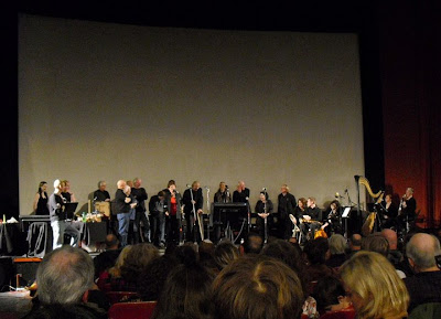
Today, thirty-one years after its original release, Will Vinton’s now classic and award-winning animation of “The Little Prince” was presented at the Hollywood Theater with some of the original voice cast members reprising their roles live, along with sound effects artists and live music.
I couldn't make it but I dearly would have loved to. After 13 years with the Will Vinton Studios it would have been wonderful to talk once again with these gifted, creative people.
Megan Kahrs, another former employee, was there and posted some pictures on facebook which I'm using without her permission.
The middle picture starting with the mustachioed Mr. Vinton on the left, includes Joan Gratz, who won her own Oscar for the claypainted "Mona Lisa Descending a Staircase", and master animator/director Barry Bruce who defined the look of Claymation.
If you've never seen "The Little Prince & Rip Van Winkle" or "The Adventures of Mark Twain" they are available here: http://willvinton.net/filmDistribution.htm
This blog is peppered with postings on Will Vinton, Joan Gratz, and Barry Bruce if you're interested.

Labels:
Animation,
character design,
sculpture,
Stop Motion,
Will Vinton
Friday, November 12, 2010
Retouching Family
My wife found this damaged photo of our two oldest kids. She was very upset so I did a little Photoshop on it. You have to love that Clone Brush!
Click on images to enlarge
Click on images to enlarge
Wednesday, November 10, 2010
Finding Stop Motion
I tried to build a stop motion demo reel with the bits and pieces I have kept but found most was in an unusable format. The usable things are the commercial bits at the beginning with Barbie and all. I found some badly compressed sequences on YouTube of my work from the TV show "The PJs" shot at Will Vinton Studios. It looks awful but I captioned the characters I'd done and the whole process brought back a lot of memories.
"PJs" ran three seasons and was controversial from the start. From an animation stand point it was very well organized and people were top notch making it happen. This was gorilla animation and I can't remember the exact daily frame count needed to stay on schedule but it was well over a hundred frames. It meant no 'pop-through' where you put the puppets through a few trial shots. Many times it involved group shots with the entire cast, each one having their own idiosyncrasies.
It's a very different kind of animation than commercial or theatrical.
Labels:
Animation,
personal art,
Stop Motion,
Will Vinton
Thursday, November 04, 2010
Team Work
Sandro Cleuzo has a great blog and this posting talks about the team work at Disney when Frank Thomas and Milt Kahl were still animating. Even a master like Frank would go to a stronger hand to get better results. The first image is by Frank and the second is an improved pose by Milt. See more and read the whole article by clicking the title.
Frank Thomas
Milt Kahl
Frank Thomas
Milt Kahl
Labels:
Animation,
character design,
Frank Thomas
Friday, October 29, 2010
Dark Void
I animated this sequence for the game The Dark Void sometime ago but just found it on YouTube. The character at the end overhearing their conversation is a different design than what was originally there. The sequence is a little stiff to me now but still in keeping with the rest of the acting in the game for the most part. It is choppier because this was captured from the game engine and the refresh rate isn't always fast enough.
I feel compelled to mention there is no motion capture in this game. It seems mo-cap is becoming more prevalent in cg animation but it wasn't used here.
I feel compelled to mention there is no motion capture in this game. It seems mo-cap is becoming more prevalent in cg animation but it wasn't used here.
Tuesday, October 26, 2010
The Pumpkin Queen
All Hail The Pumpkin Queen! This is a photo of my granddaughter taken by her Aunt Joanne Zarzana. I pushed it over the top by adding the kitties. This will probably be my next painting.
Labels:
Miscellaneous,
original art,
personal art,
Photoshop
Saturday, October 09, 2010
Speed Painting
I'm just playing with the stills I shot of my painting "After the Hunt". They weren't registered and shot under different lighting conditions. I tried to tidy them up as best I could.
Labels:
illustrations,
original art,
paintings,
personal art
Sunday, September 26, 2010
Deep
Another free-view stereoscopic painting. You know you've got to cross your eyes and focus on the image that forms in the middle
Labels:
illustrations,
life drawing,
original art,
paintings,
personal art,
stereoscopic
Wednesday, September 22, 2010
More Stereo Life Paintings
You must cross your eyes and focus on the image that forms in the middle to view it in 3D.
Click on Images to Enlarge
Click on Images to Enlarge
Labels:
life drawing,
original art,
paintings,
personal art,
stereoscopic
Tuesday, September 21, 2010
Stars
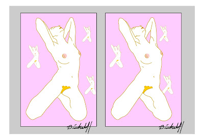
I was thinking of calling this "X", or "X Marks the Spot". Anyway, it's another stereoscopic free view style life drawing of mine. You'll find others scattered through this blog.
As always you must cross your eyes and focus on the image that forms in the middle to view it in 3D.
 Click on image to enlarge
As always you must cross your eyes and focus on the image that forms in the middle to view it in 3D.
 Click on image to enlarge
Labels:
life drawing,
original art,
paintings,
personal art,
stereoscopic
Thursday, September 09, 2010
Saturday, August 14, 2010
After the Hunt
Doing my daughters nursery picture, (see earlier post), got me into the painting mood so I've started a new one. I took the sketch and enlarged it onto 8"x11.5" pages which I taped together to make the canvas size I wanted. Then I took transfer paper and traced the pattern onto my canvas and went over it with burnt umber to make my under sketch. Now I've got to let it dry and then do color toning. It feels good to smell the turpentine again and get messy.
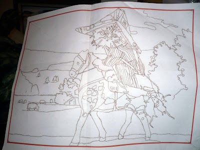
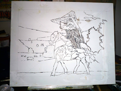
This next bit may confuse some but I took a Cadmium Red and toned the whole picture with a thin wash. Even though the picture has primarily rolling green hills and trees this wash of red will unify everything and give it a depth I want. The last image is an over-all tone leading up to detailing. I hope I find time to finish it.
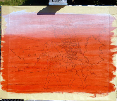
Cadmium Tone
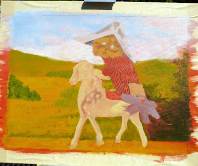
Tone Pass
This is a first pass at detailing after my toning was done. I may need a few more sessions before it's finished but because it's oils I will need to let this dry. I may have to get several paintings going in various stages if I want to get a body of work done.
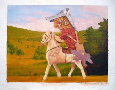
1st Pass
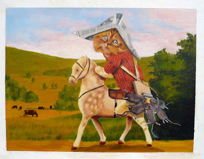
2nd Pass


This next bit may confuse some but I took a Cadmium Red and toned the whole picture with a thin wash. Even though the picture has primarily rolling green hills and trees this wash of red will unify everything and give it a depth I want. The last image is an over-all tone leading up to detailing. I hope I find time to finish it.

Cadmium Tone

Tone Pass
This is a first pass at detailing after my toning was done. I may need a few more sessions before it's finished but because it's oils I will need to let this dry. I may have to get several paintings going in various stages if I want to get a body of work done.

1st Pass

2nd Pass

Thursday, August 12, 2010
El Tabador Returns!
I was fortunate enough to work on the latest El Tabador spots for Koodos. You may remember an earlier post where I talked about how fun the first commercials were too.
I did the running shots jumping over the cup and running up the books plus the very beginning where he rises and says, "Join me in the fight for phone freedom!", which is used on all the spots.
I did the running shots jumping over the cup and running up the books plus the very beginning where he rises and says, "Join me in the fight for phone freedom!", which is used on all the spots.
Tuesday, August 10, 2010
Nursery Picture
My daughter is having her first child and wanted a painting of a ladybug for the nursery. Her husband complicated it by wanted a baby riding the ladybug so this is what I came up with. I don't know why my camera won't take more focused pictures.
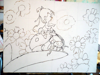
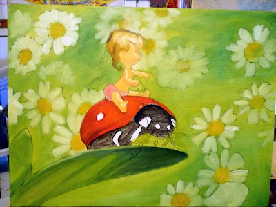
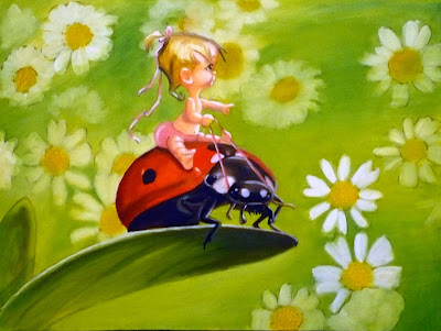 Click on image to enlarge


 Click on image to enlarge
Labels:
character design,
illustrations,
original art,
paintings,
personal art
Friday, August 06, 2010
Claymation tools
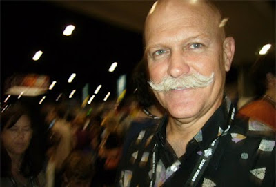 Will Vinton
A fellow animator was asking how certain things were accomplished at Will Vinton's Claymation Studio. Here is a paraphrased version of the questions and answers.
Q: When you join pieces together, how do you erase (blend) the seams? Especially when reaching across a crowded set to get access to the puppet at a 45 degree angle.
A: You might want to consider ways of gaining access to your characters so you don't have to bend in unnatural ways. If you can pin register props like tables and chairs you can remove them and get to your figures and then replace them for the shot. I've had walls on hinges that swung out of the way so I could get to characters. If a character is seen from the waist up or never walks or is seated, we sometimes mounted them on a square platform and registered them with 'L' brackets screws to the floor. We lift the thing out and drop it back into the brackets.
Q: What kind of tooling technique is used to get that mottled/carved wood look? Gairy Bialke was probably best known for that style. It looks awesome, especially on arms and legs.
A: The chiseled look to some Claymation probably started with Barry Bruce who used what became known as a Barry Stick. It has a flat surface with a blade on one side and a round edge too. We made our own custom tools in the wood shop and a variation made by Jeff Mulcaster became my favorite tool. It's small and extremely versatile. (See diagram)
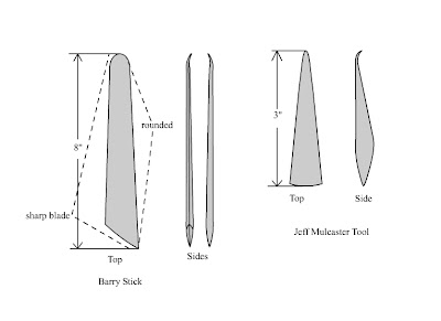 Click Image to Enlarge
Basically the flat side was used to spread the clay, kind of like frosting a cake. We were using the soft Van Aken and the flat tool side also was used to block out the shapes giving you that carved kind of look. The sharp blade created creases and the round side was used to smooth and blend . The curving tip was used for prying open spaces, smoothing and detailing, and on the Mulcaster tool it was great for detailing small areas.
Q: In EB's mustache at the end of Claymation Easter, how was it modified from fame to frame to appear as though the lines were bending (looks almost like morphing or deforming, but the lines would have to be re-scribed, and it doesn't look like they are).
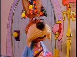
A: The mustaches were clay replacements you could bend and shape so they looked like they were morphing until you replaced it with the shape you wanted. We has a mold to make copies.
Q: How was the lip sync done on the Raisins? This is probably my biggest question because I can't tell if it was completely torn apart and re-sculpted every frame, or if it was a single expression being re-worked frame to frame. Even with live action reference, I would have trouble with some of those mouth shapes. It's incredibly fluid.
A: The lip sync was done using live action reference of the actors preforming their lines. We all had Moviolas at our sets and tried to match the lip shapes the best we could. Generally the mouth was carved out leaving a cave from cheek to cheek and nose to chin which was lined with black clay. The mouth was built up using rolls of flesh colored clay spiraled around the edges of cave until you got the mouth size you wanted. Then you smoothed out the spiral and added the lip details. If you were very careful and remembered where your cave was you could cut these mouth shapes out and use them again like replacements.
Labels:
Animation,
sculpture,
Stop Motion,
Will Vinton
Sunday, July 25, 2010
The Man Who Planted Trees
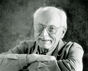
Daniel Caylor brought this film back to my attention; "The Man Who Planted Trees" by Frédéric Back. Even in this degraded form the message and artistry still inspire and impress me.
This is an important film and one of the most perfect uses of animation conveying complex emotion and message with every facet of sound and design in an entertaining and beautiful way. Like good art should it communicates in a way other media could not and is poetic and spiritually uplifting all the more so because it is animated.
Clicking on the title will take you to an interview with Frédéric Back.
Sunday, July 18, 2010
Dr. Seuss Models
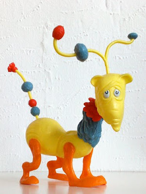

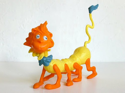
I rediscovered some of my favorite toys that I’m sure had a lot to do with shaping my career choices.
In the sixties, Revell created a series of model kits designed by Dr. Seuss. They were colored vinyl plastic pieces that snapped together and required no painting or glue. Better yet you could intermix body parts with other kits and make your own creatures! These were some of the best toys ever made! Too bad there is nothing like them today that I know of.
Seen here from top to bottom: Norval the Bashful Blinket, Tingo the Noodle-Toppled Stroodle, and Roscoe the Many-Footed Lion.
Thanks to j_pidgeon’s photostream for these great pictures. Click title to see stream.
Monday, June 21, 2010
Studio System Assistants
I'm posting a part of Matt Williames article from his blog: Hand Drawn Nomad, (click the title to take you here). I post this portion not as criticism of Disney but as further conformation of the idea that the "Nine Old Men" and other 'stars animators' of Disney owe a tremendous amount of thanks to their assistants.
In an earlier posting called First Assistants and Clean-up: the Unsung Heroes of Animation, I published an honest and grateful acknowledgment by legendary animator Bill Tyla stating his reliance on good support from his crew.
I agree with Matt and wonder why we don't know more about these wonderful artists who helped make the Lead Animators great.
_________________
I more take issue with the "Star animator" mentality that Disney is so good at pushing. If you don't know what I mean how often do you hear about Dale Oliver? Dale was Frank Thomas' assistant for a long time, and honestly he made Frank look VERY good without getting any credit himself. Find some of Franks original ruffs, they are nothing to marvel at. Look at what Dale did with them... amazing assistant work. But you never hear about him.
Matt Williames
Sunday, June 20, 2010
Work in Progress
Here's some more developmental sketches for my independent project. I don't want to give too much away but I think you can see here this is going.
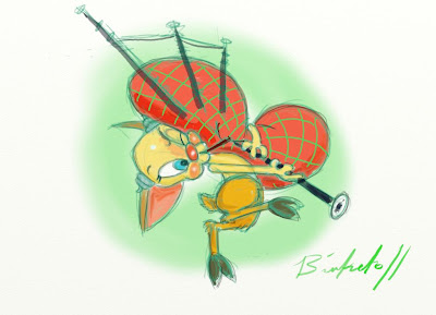
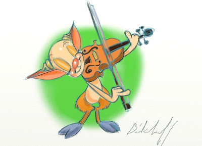 click on images to enlarge

 click on images to enlarge
Wednesday, June 16, 2010
The Things We do for Love
I'm not known for 'cute' stuff but when my daughter is having her first child, I am already turning to mush. This is the artwork I did showing my granddaughter, (yes it's a girl), riding their dog Ryley, that will be used on the Baby Shower invitations.


Labels:
character design,
illustrations,
original art,
paintings,
personal art
Tuesday, June 15, 2010
David Brown Lessons
This was taken from Bill Plympton and Patrick Smiths' Scribble Junkies Blog. The first part is there, or here: http://scribblejunkies.blogspot.com/2010/05/7-lessons-from-david-brown-part-1-of-4.html
7 Lessons From David Brown, part 2 of 4
8.Never be mean, chintzy and ugly to your secretary or she'll write a book.
9.Verbal pitches rarely make it to the screen and are frequently forgotten in the passage.
10.Nobody but the filmmakers can be trusted to form a valid opinion of a film by seeing a rough cut or reading a script. Especially marketing people. Show them the finished movie only and even then, their opinion is suspect.
11. Enthusiasm is the fuel of show business, especially unwarranted enthusiasm. Without it you can't go to work in the morning.
12.The larger number of executives in a production department, the poorer their movie. Bureaucracy dilutes the creative process – and slows decision making to a pathetic trickle.
13.This is from Darryl F. Zanuck. Interesting subject matter of a movie is more important than brilliant execution. I'd rather have a fair script on a provocative subject than a brilliant one about the sex life of an earthworm. I've had both.
14.Being a waiter, book salesman or a dealer in a casino is better preparation for a producing career than four years in film school. The best producers often are rogues and super salesmen.
Sunday, June 13, 2010
New Old School
I know there are tons of old cartoons around but, here is my attempt at getting back some of the sensibilities I enjoy from the classic style of 1930's animation using digital software. This is partly a reaction to the very angular, flat, hinged vector designs so prevalent today.
This is a work in progress and I may darken the background and add sound and a gag at the end.
This is a work in progress and I may darken the background and add sound and a gag at the end.
Labels:
Animation,
character design,
original art,
Paperless Animation
Friday, May 28, 2010
Dear Client and Agency People...
I’ve wanted to tell you this for years. You are doing yourselves a big disservice every time you single frame through your animation. I understand you probably want to get your moneys worth and are checking to see how much movement you’re getting but each time you panic and say on frames 100 through 103 the character is ‘off model’ or only the whites of the characters eyes are showing on frame 30 and want fixes, you weaken your animation. Please play the scene at speed and see how it feels. Many times those distortions are intentional and as knowledgeable as using terms like ‘off model’ sound there are other terms like ‘squash and stretch’ and ‘smear’ which are real phenomenon observed from the study of organic life. Smear is really a technique simulating the blur caused by a fast moving object caught on slow speed film but it’s a great method for snappy actions. These are tools the animator uses to impart life and by removing them you instill a plastic rigidity into your characters that makes them that much more lifeless. Many times you react to your changes even more negatively and want to restage the action because now it’s not working for you. Trust me, try watching your dailies at speed and stop the habit of single framing through the animation. If there is a real problem it will leap out at you. Remember people will not be watching this one frame at a time and believe that the animators love their media and want it to look as good as possible for you and for them selves.
A few stills showing the 'smear', from Disney and Warner Bros.

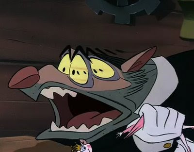
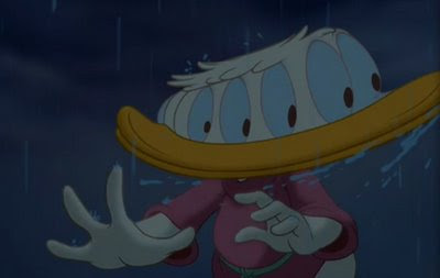
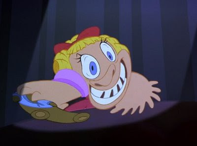

A few stills showing the 'smear', from Disney and Warner Bros.


Saturday, May 22, 2010
Crew Jacket
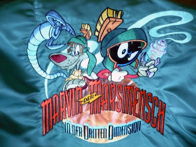
I've had some great opportunities and Cartoon Brew did a posting that made me dig out a piece of my past. Brew mentioned "Marvin the Martian in the Third Dimension", one of the first stereoscopic theme park attractions done in the early days of computer animation. I've included the trailer that sparked the CB posting below.
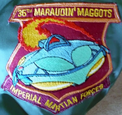
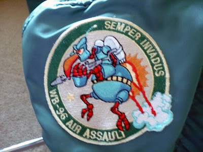
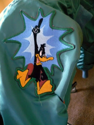
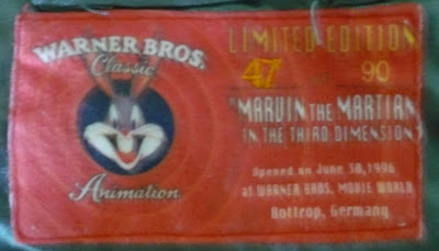
I did some character rigging and animated the 'Instant Martians' and some of the dog K9 and Marvin. From that came an amazing crew jacket that is a real flight jacket with cool embroidered patches. Sorry about the poor photos but these patches are on the arms, front and the big patch of K9 and Marvin fill almost the entire back of the jacket. The label with Bugs shows its a limited edition and was made for the Warner Bros. Movie World attraction which opened in 1996 at Bottrop Germany.
I love this jacket but am too embarrassed to wear it.
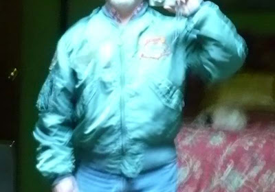
 UPDATE: Someone has posted the entire show on YouTube. It's not in 3D and I don't know how long it will stay up before taken down, but it's all there.
I did some character rigging and animated the 'Instant Martians' and some of the dog K9 and Marvin. From that came an amazing crew jacket that is a real flight jacket with cool embroidered patches. Sorry about the poor photos but these patches are on the arms, front and the big patch of K9 and Marvin fill almost the entire back of the jacket. The label with Bugs shows its a limited edition and was made for the Warner Bros. Movie World attraction which opened in 1996 at Bottrop Germany.
I love this jacket but am too embarrassed to wear it.


 UPDATE: Someone has posted the entire show on YouTube. It's not in 3D and I don't know how long it will stay up before taken down, but it's all there.
Subscribe to:
Comments (Atom)


